Play Film
Strongbow is the UK’s most popular cider brand, but the category as a whole was in steady decline. To return to growth, cider needed to connect with younger audiences.
To engage a new generation of consumers, we were brought in to reinvigorate the Strongbow brand. We focused on embracing its authentic truth: celebrating its refreshing natural flavours while amplifying the direct, matter-of-fact tone of voice that has always set the brand apart.
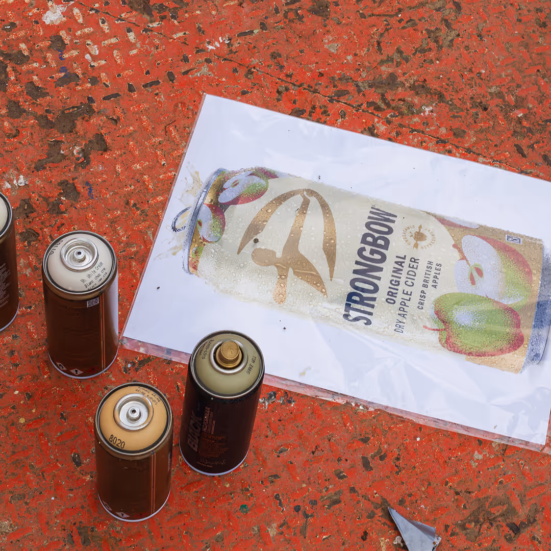
The new brand system reimagined the cans with colour palettes inspired by their respective flavours. The iconic archer emblem remained prominently on pack, but was evolved to feel less masculine and more inclusive. Bold typography underscored the straightforward confidence of the brand.
This wasn't simply a packaging refresh. It was the foundation for a broader repositioning of Strongbow as a proudly British brand rooted in real people, real refreshment and everyday culture.
Building on this platform, we developed Strongbow's next chapter: Refreshing the Nation. At a time when ideas of British identity can often feel divided or complicated, we found something that unites people across the country: the language they use to express those small moments of satisfaction and refreshment.
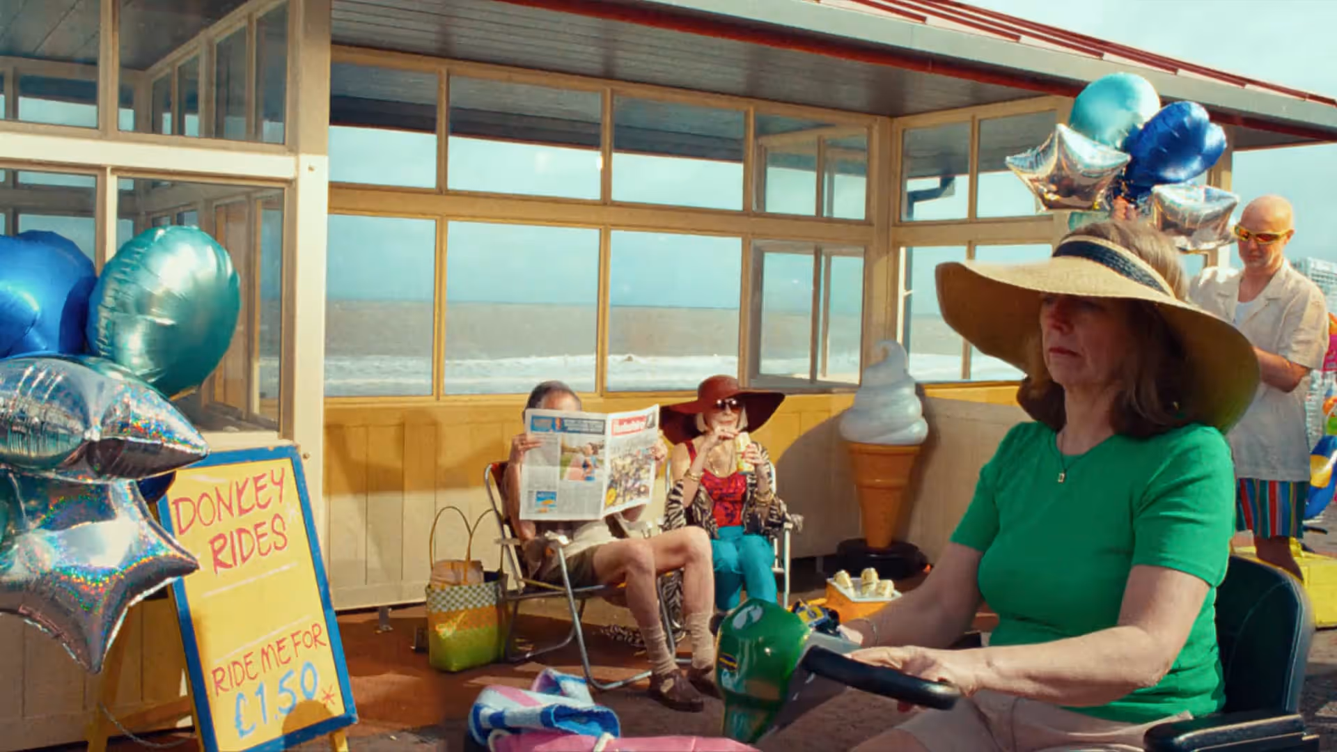
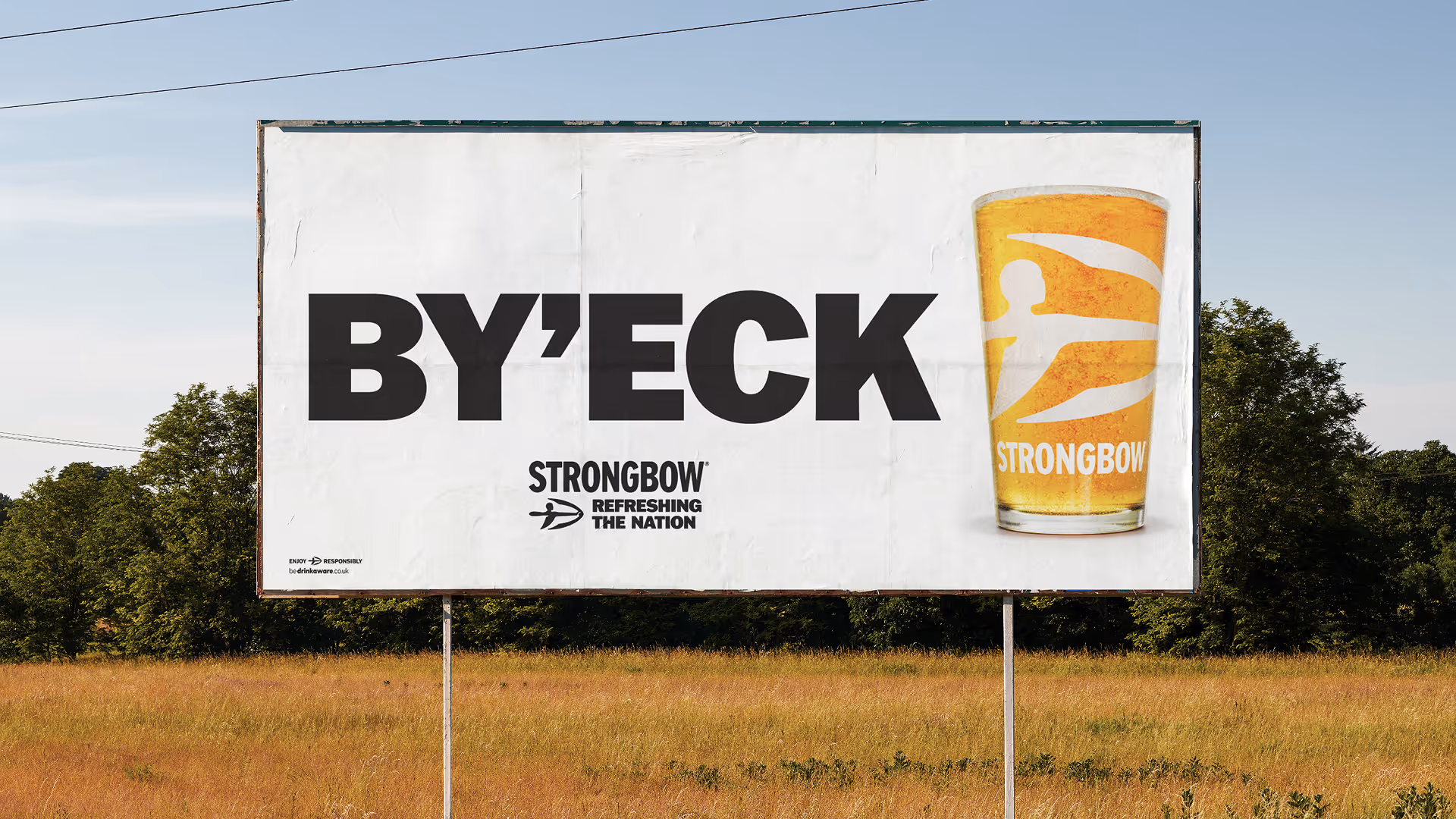
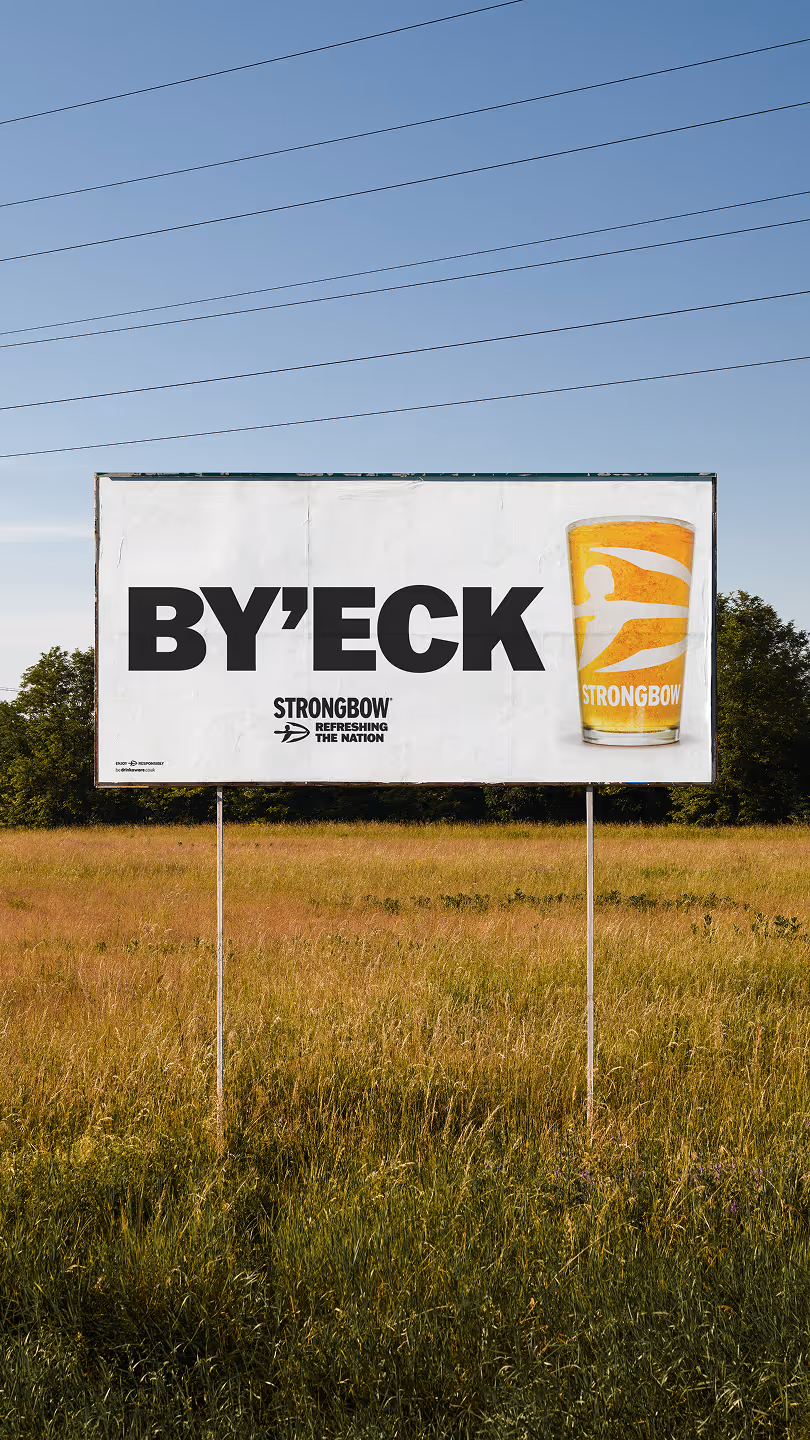
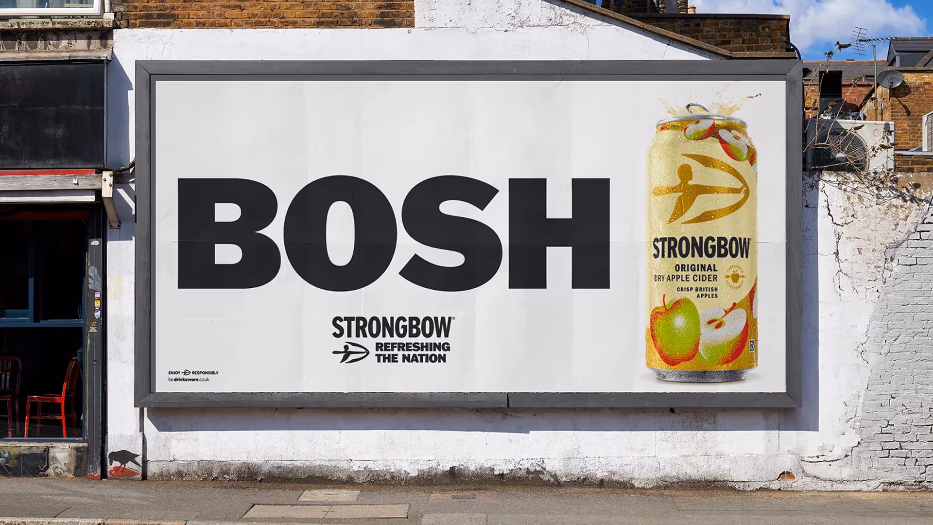
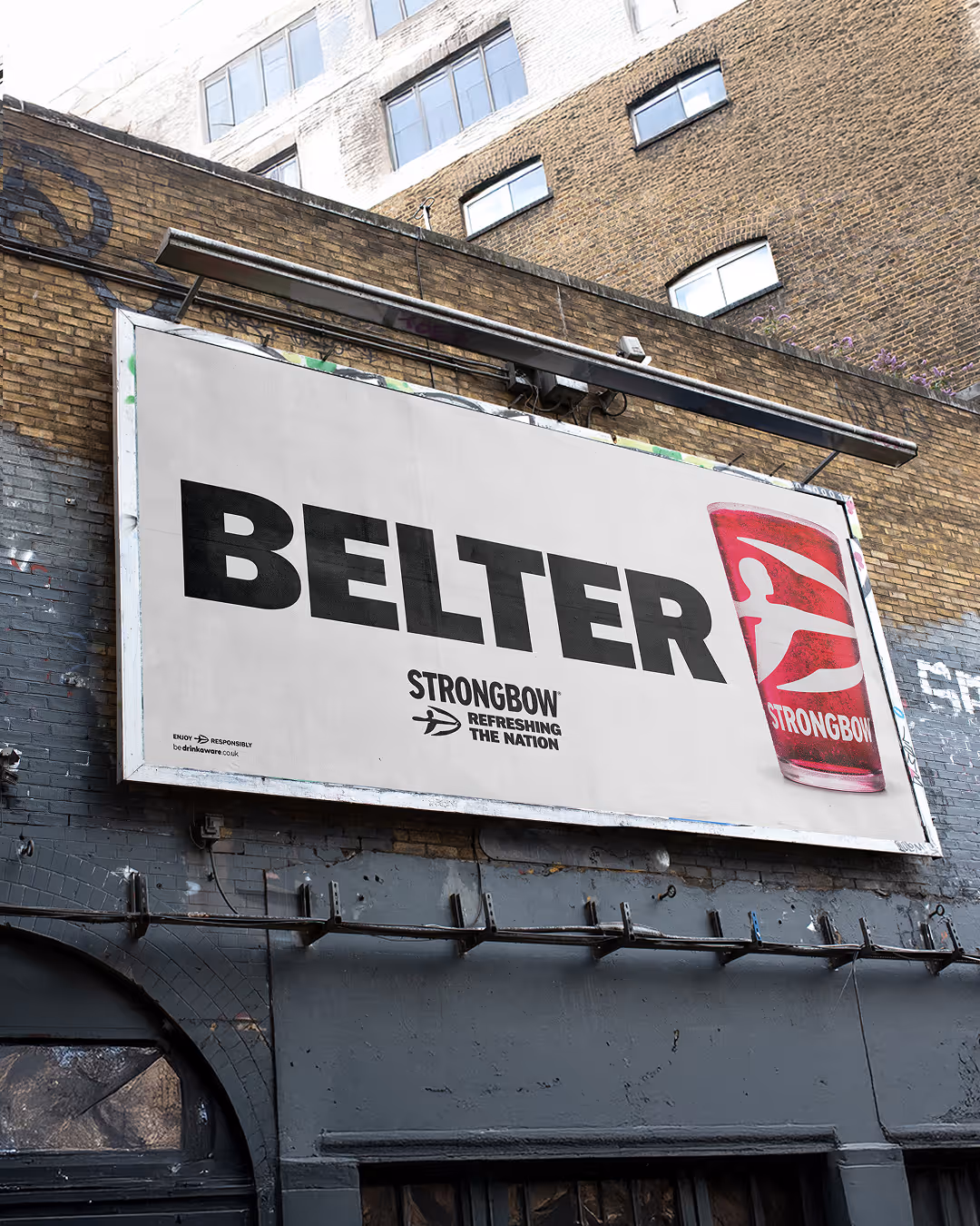
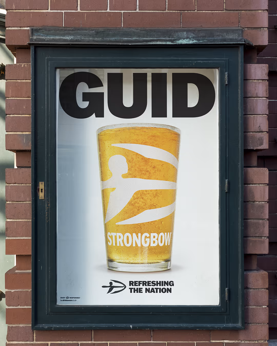
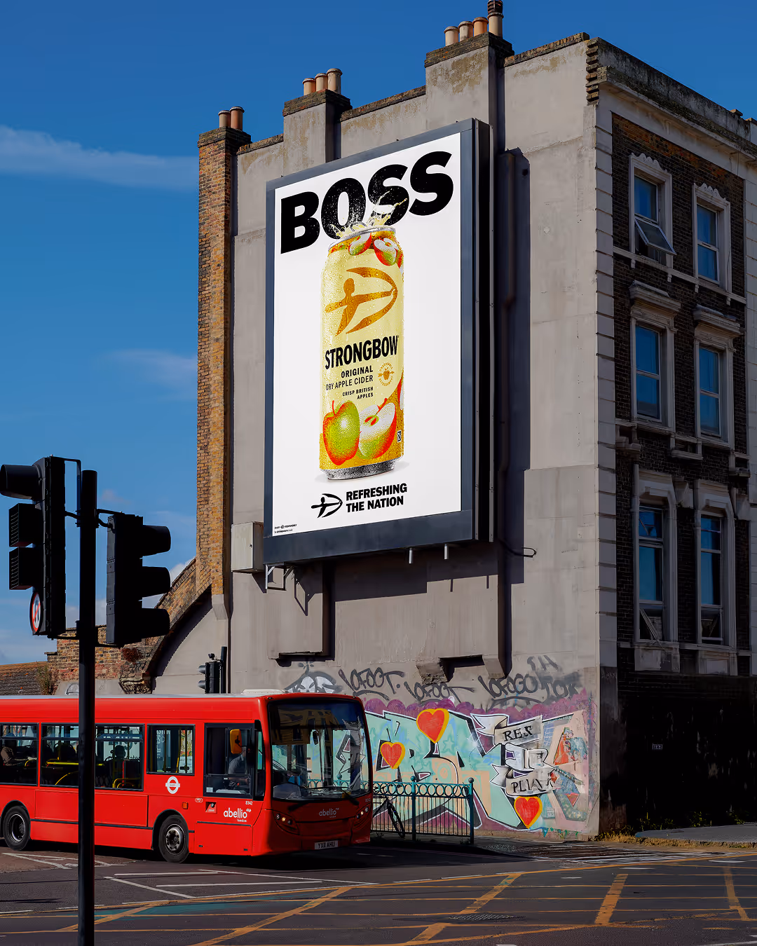
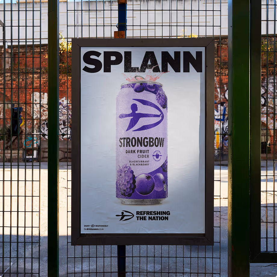
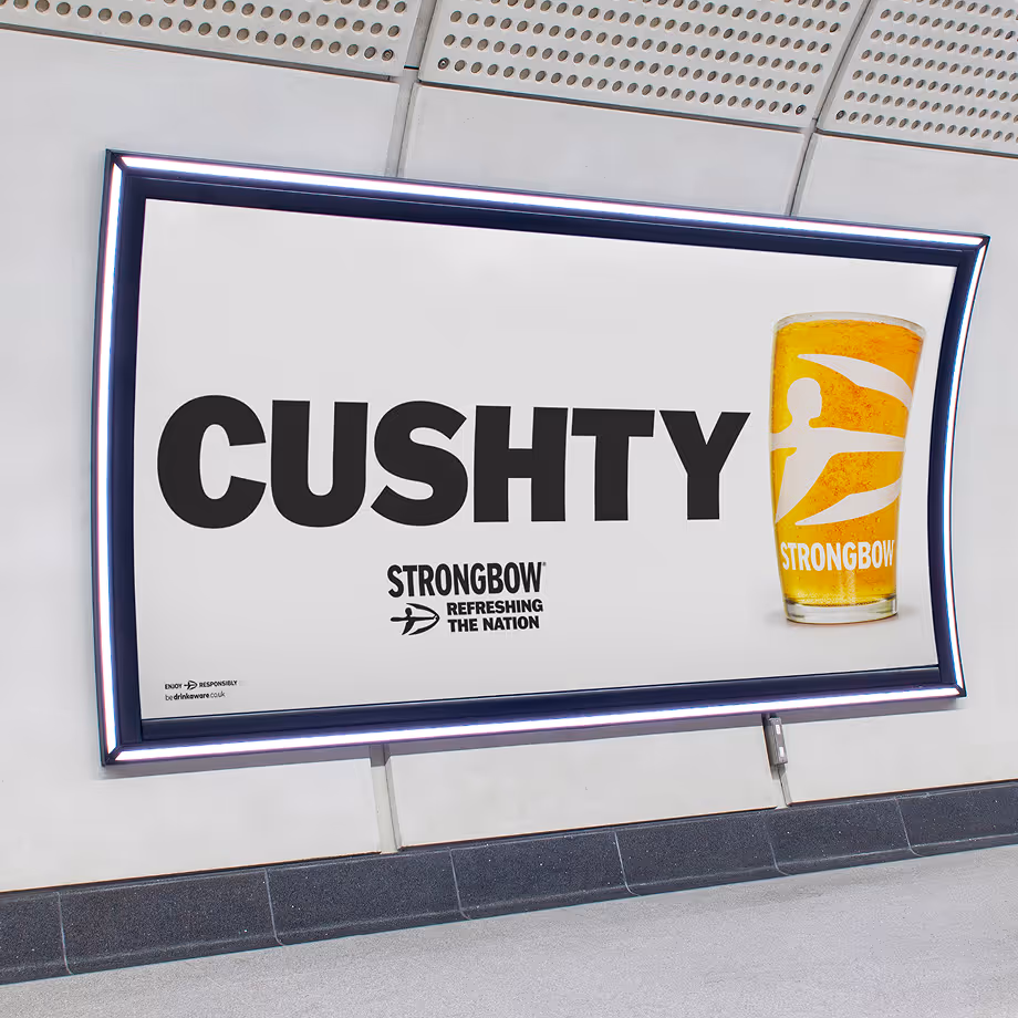
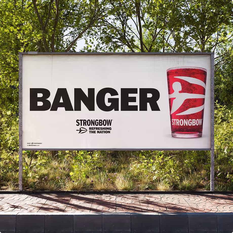
The campaign celebrated the richness and diversity of British dialects, turning the first sip of Strongbow into a uniquely local expression. Whether it's "belter", "lush", "proper", "cracking" or countless other regional phrases, the work highlighted the many different ways people across Britain describe a refreshing moment.
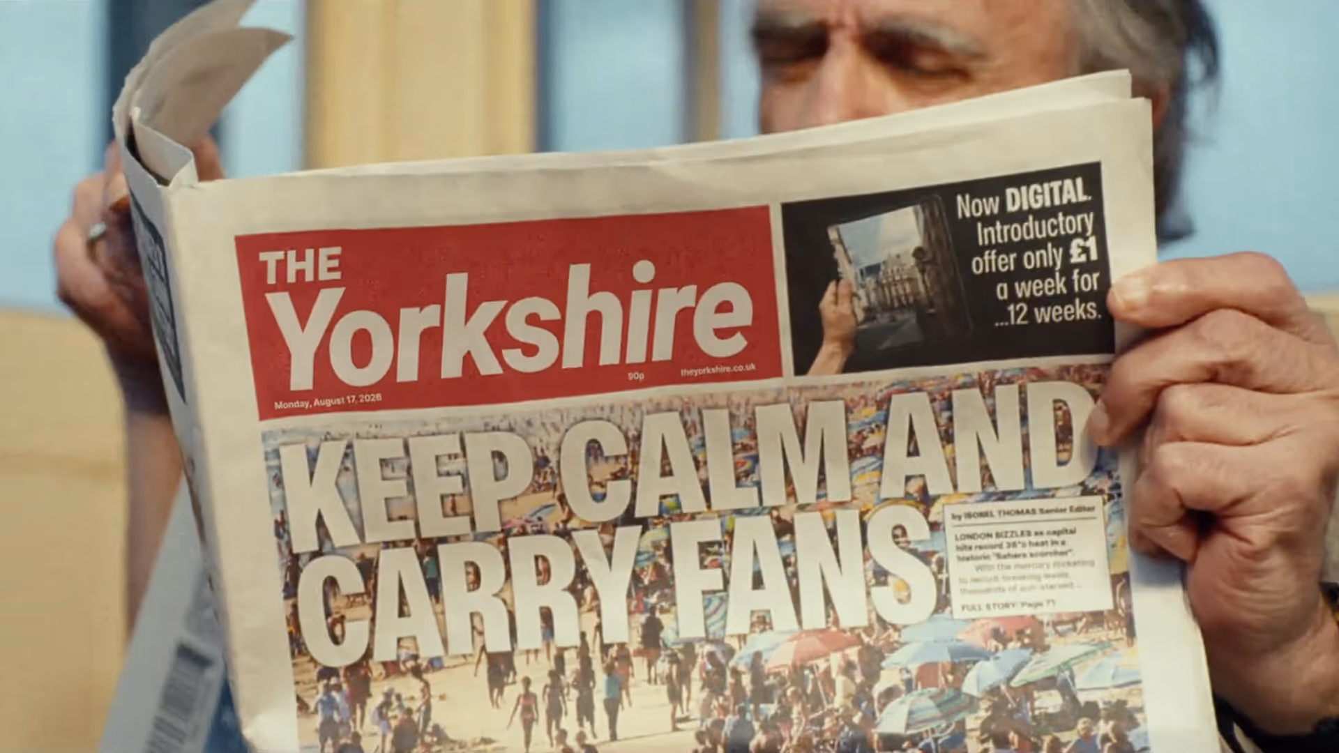
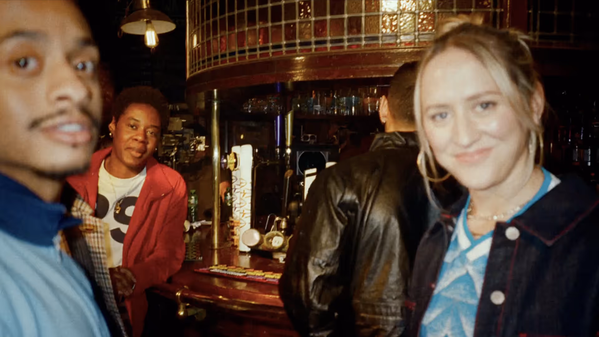
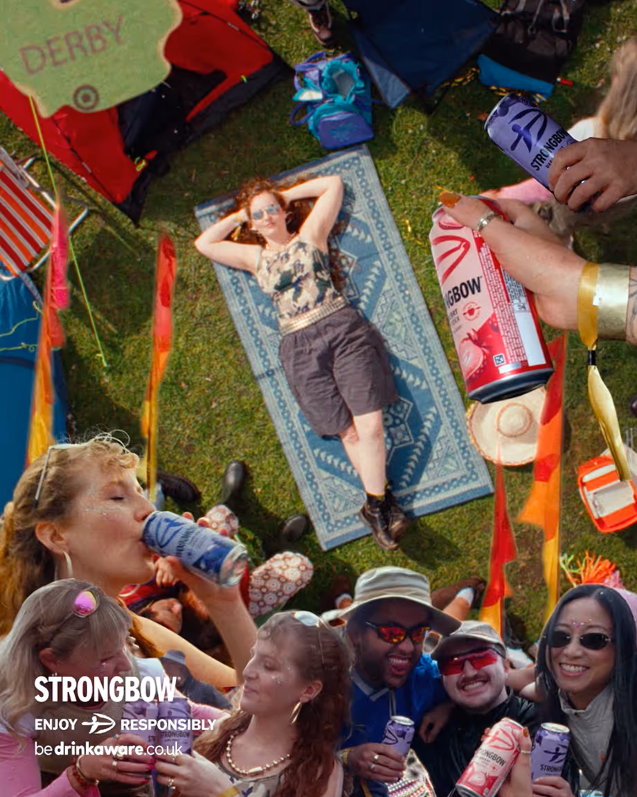
A hero film directed by Glenn Kitson brought this idea to life through an authentic portrait of modern Britain. Featuring real people, genuine accents and recognisable moments from everyday life, the campaign positioned Strongbow not just as a cider brand, but as a cultural fixture woven into the fabric of contemporary Britain.
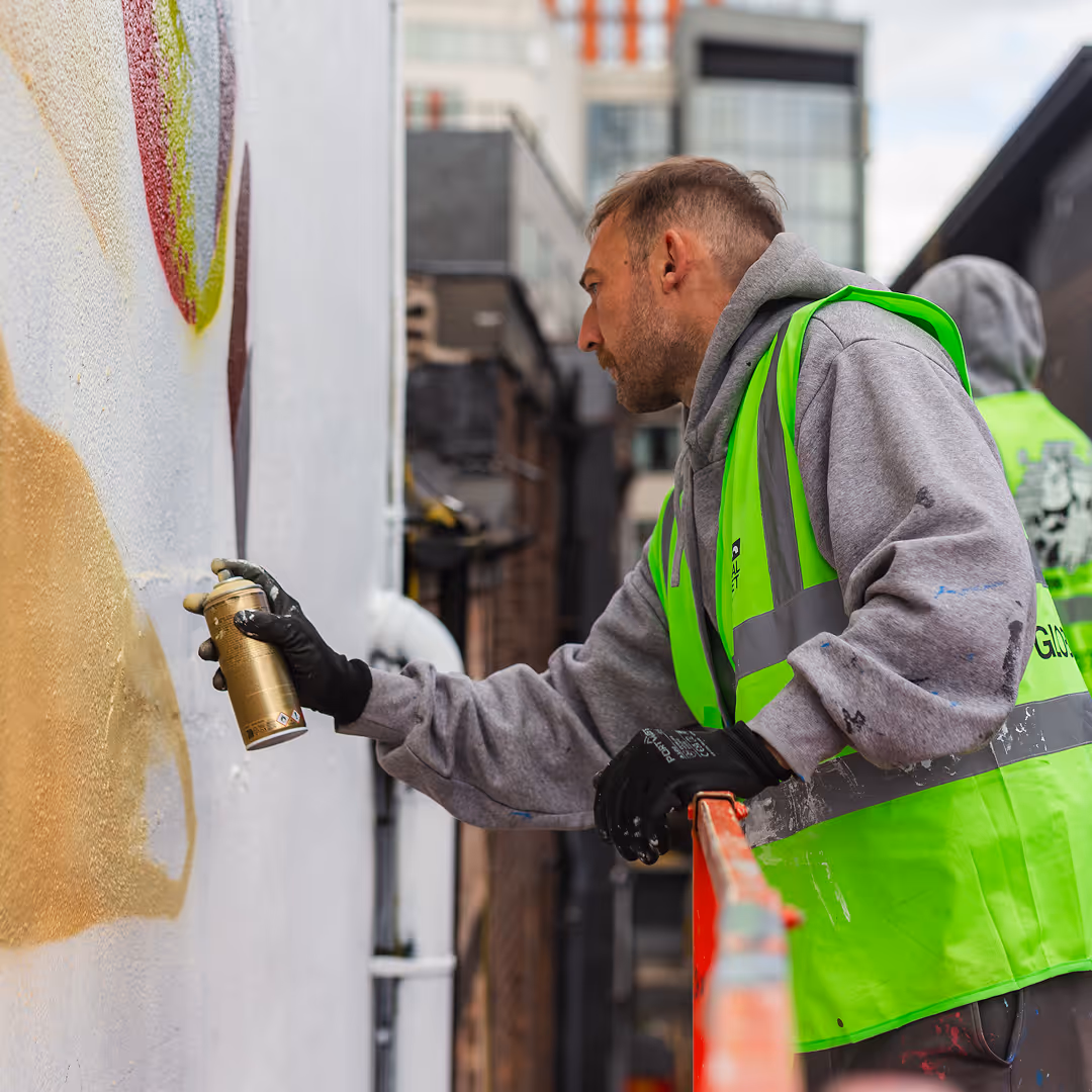
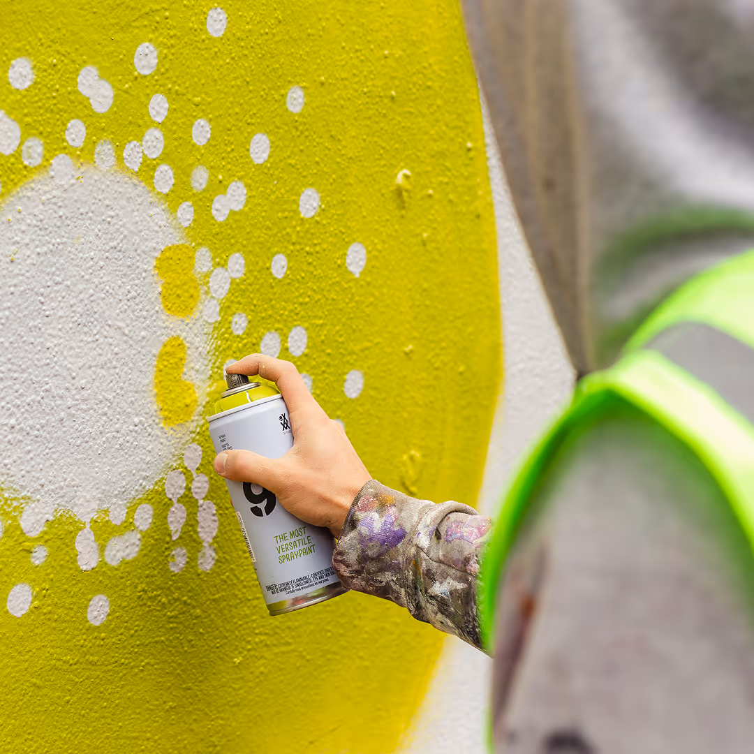
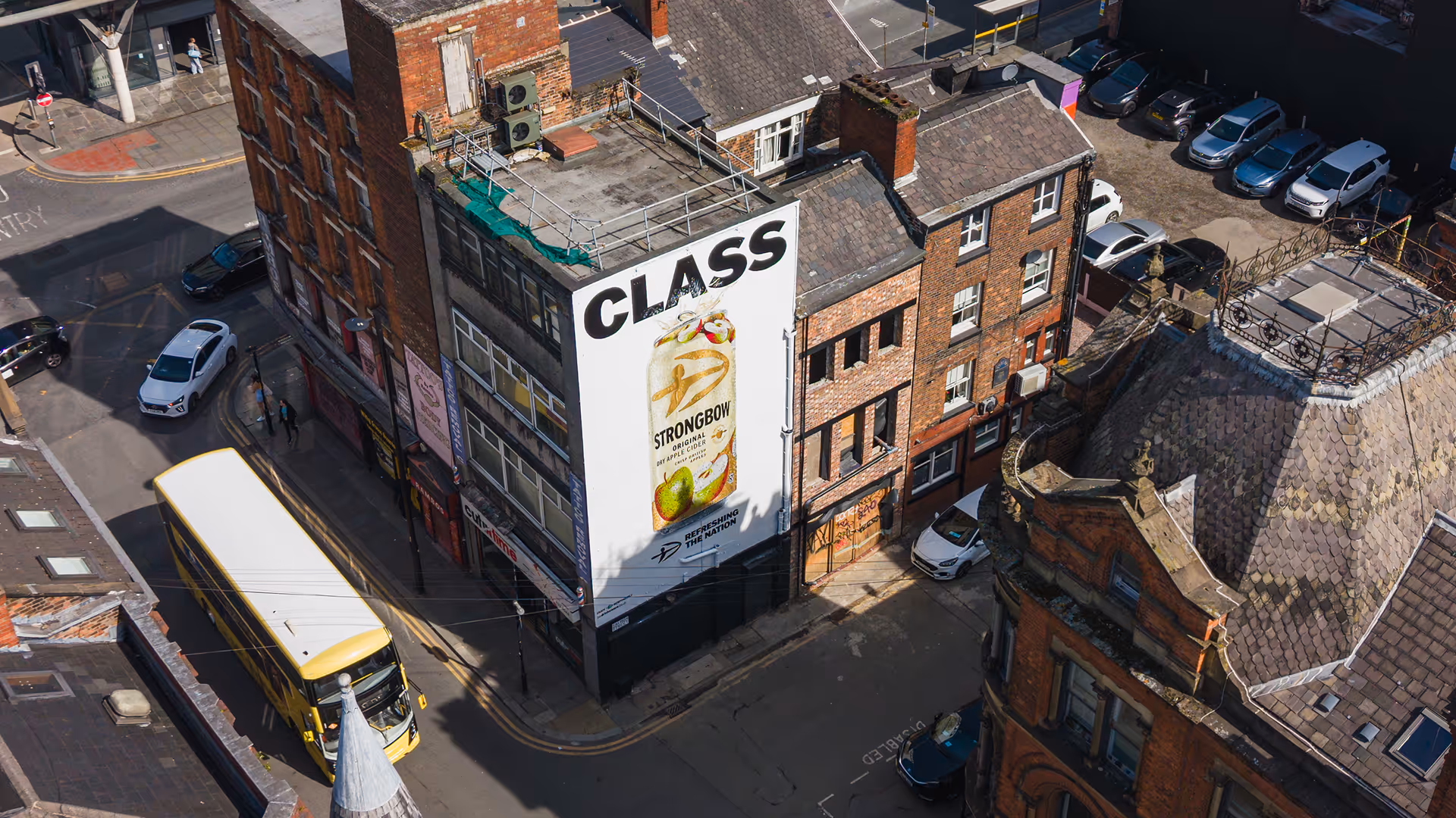
The idea extended across a nationwide out-of-home campaign featuring more than 50 regionally tailored executions. Each poster spoke in the language of its location, creating work that felt simultaneously hyper-local and nationally connected. Together, they formed a celebration of the humour, character and individuality found across the UK.
To support the platform across digital channels, we created a flexible content system designed around regional language, cultural observations and everyday moments of refreshment. This allowed Strongbow to participate in culture at speed, while maintaining a consistent brand idea. By combining local relevance with a unifying national platform, the campaign delivered a modern expression of Britishness that felt authentic, inclusive and unmistakably Strongbow.
Strategy
Identity
Design
Packaging
Campaign
Director: Glen Kitson
Music: The Streets


This is a huge milestone in 60 years of Strongbow, with the biggest and boldest redesign and campaign ever. Setting the pace for what’s to come.”