
Fortnum & Mason
Creating a type family for a British institution

300 years in the making, we created Fortnum's first fully bespoke typeface family with Colophon Foundry.
The brand needed to move away from the increasingly generic and overused font Gill Sans. As well as building a new serif that had better readability and personality, from button to billboard, than the classic font Century.
We delved into the Fortnum's archive for inspiration – finding details and quirks from that would build a robust set of design principles to draw from.
The new fonts capture the essence of a contemporary British brand, honouring its past while embodying modern design principles and its vision for the future. Ensuring the brand remains a symbol of British design and innovation.
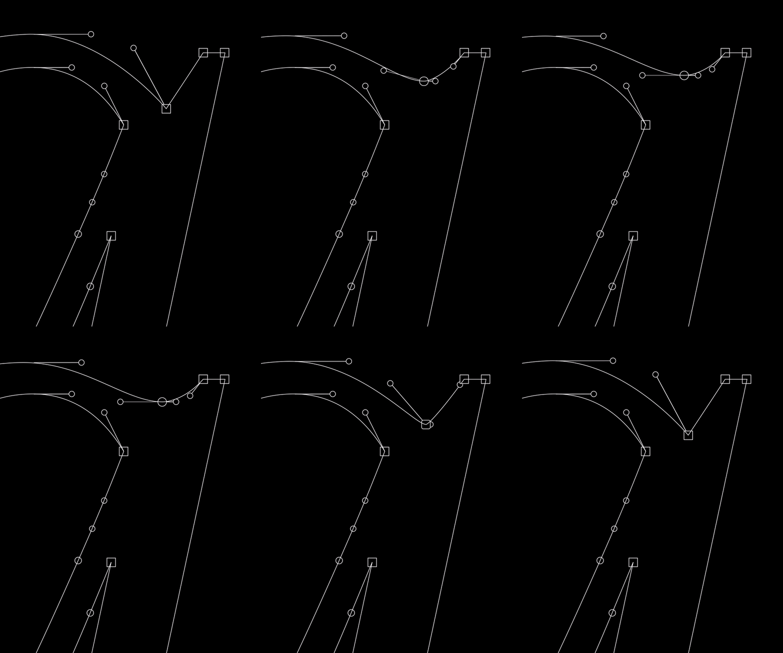


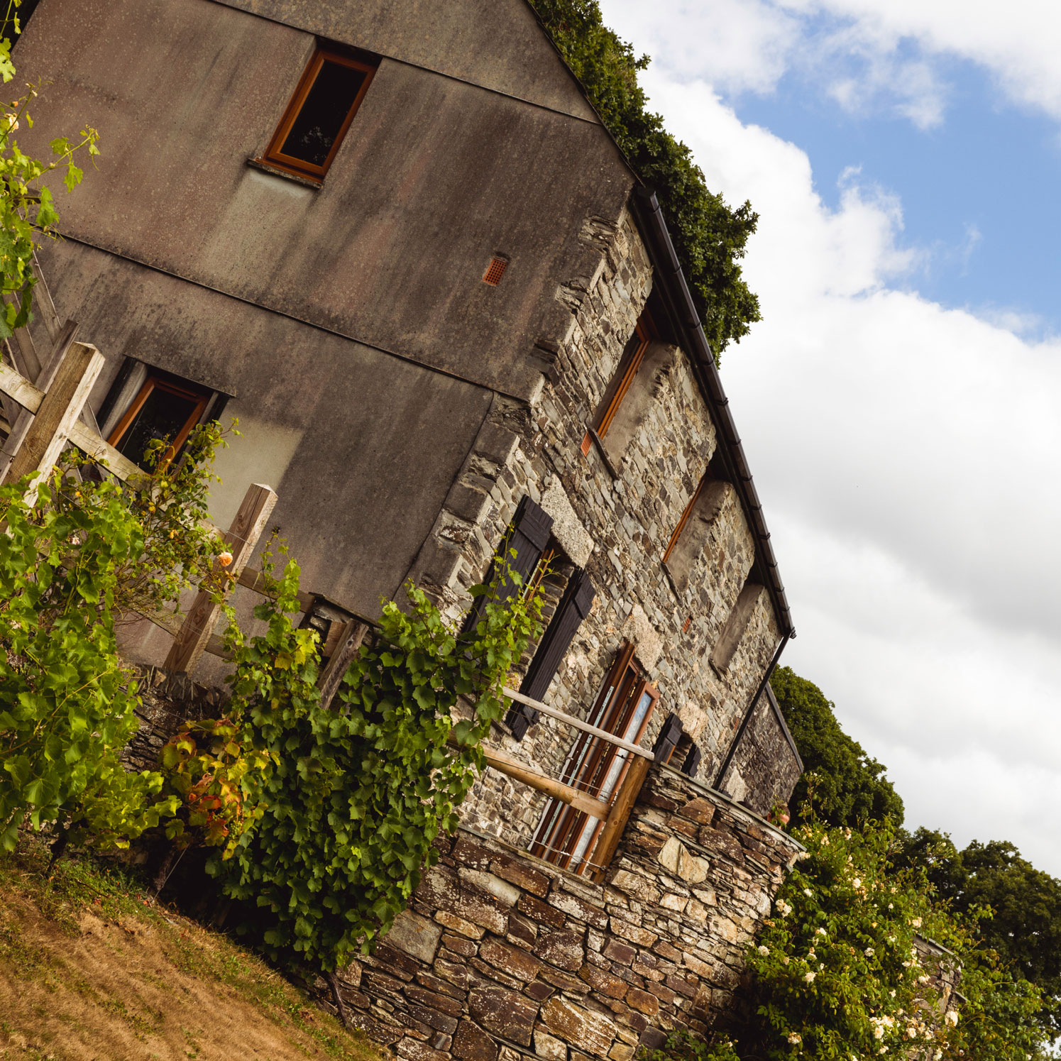
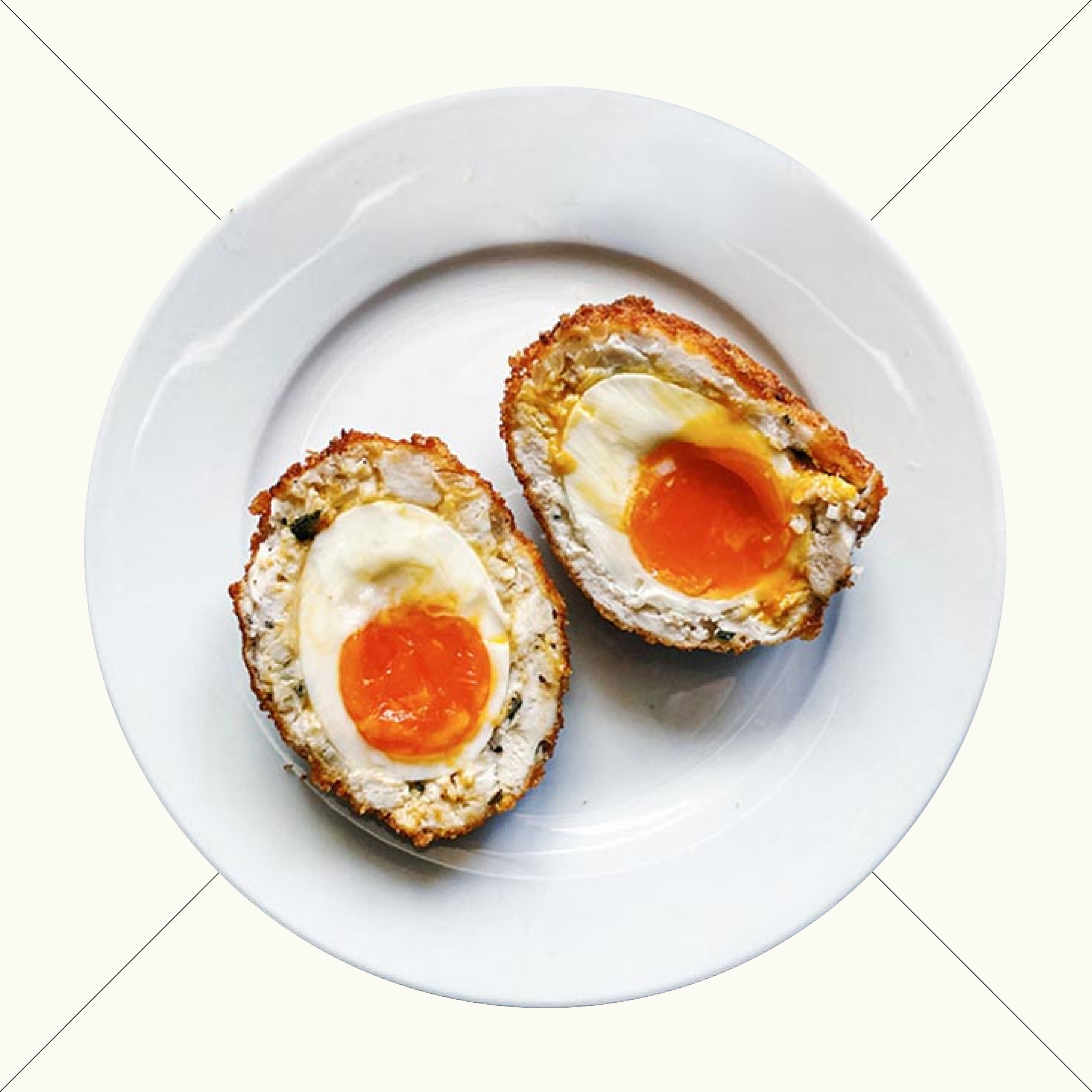
The challenge for creating the two main faces was to feel distinct from one another, but have a harmony when used together. After all, Fortnum & Mason was started back in 1707, by two very different personalities - but both came together for the greater good of an enterprising business opportunity at 181 Piccadilly.
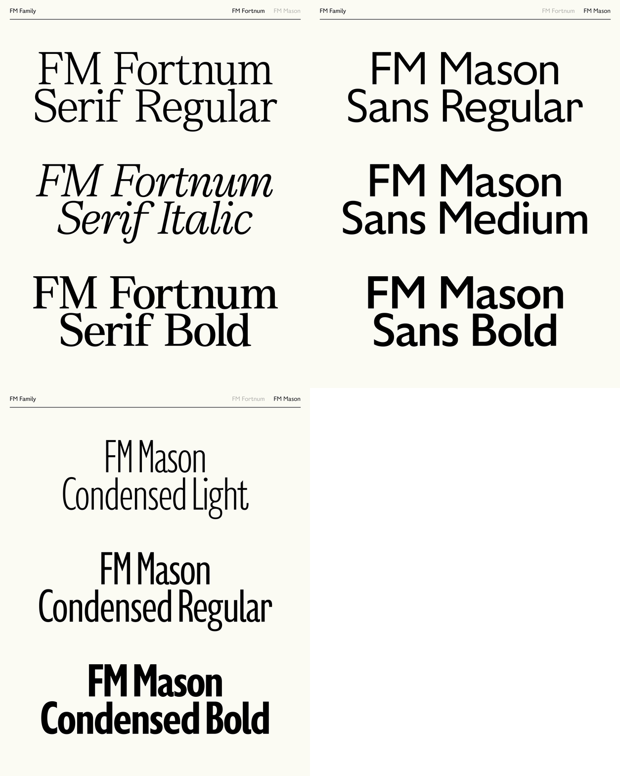
The type family comprises 3 collections including a sans serif, its condensed counterpart and a serif totalling 12 styles.

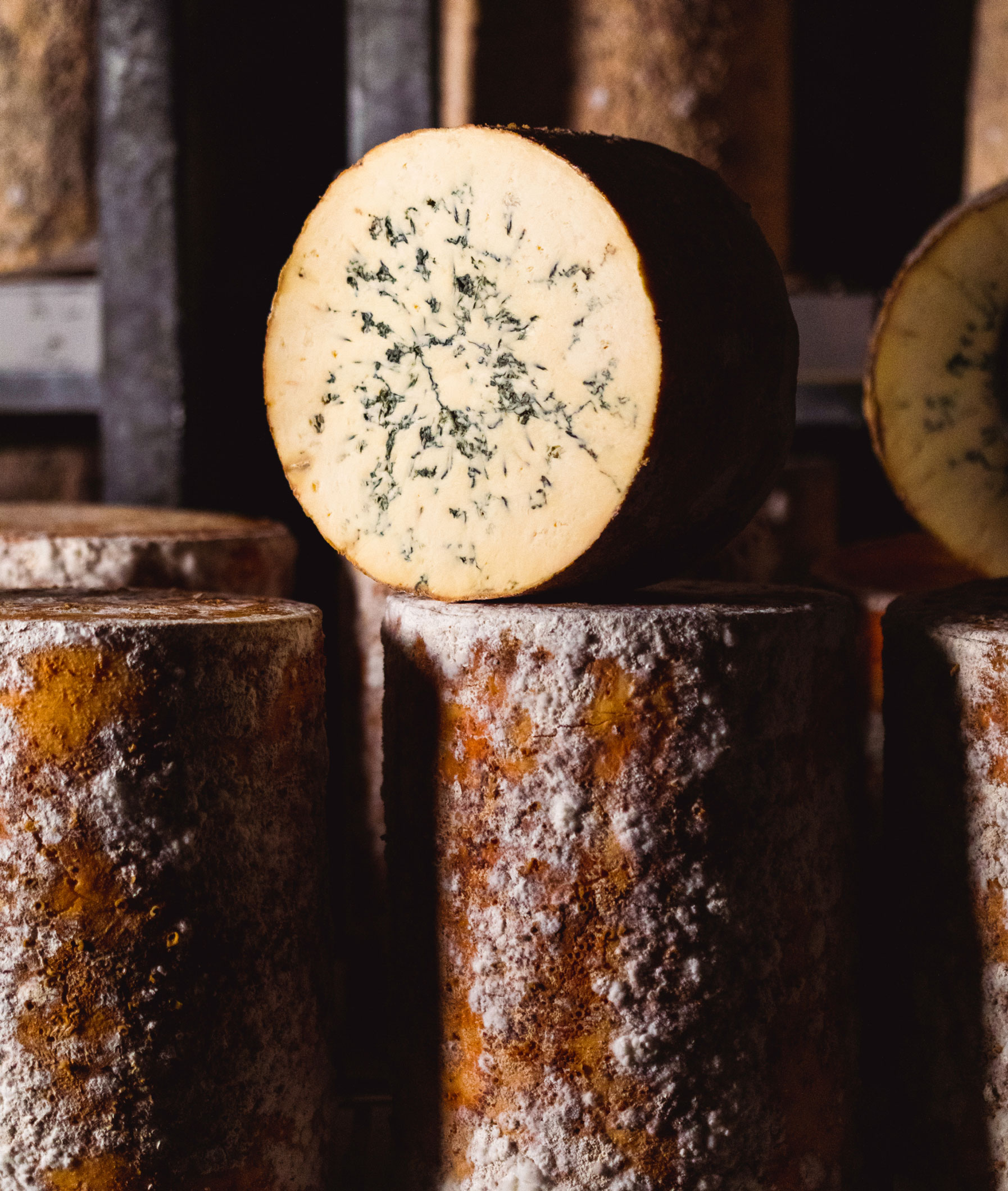

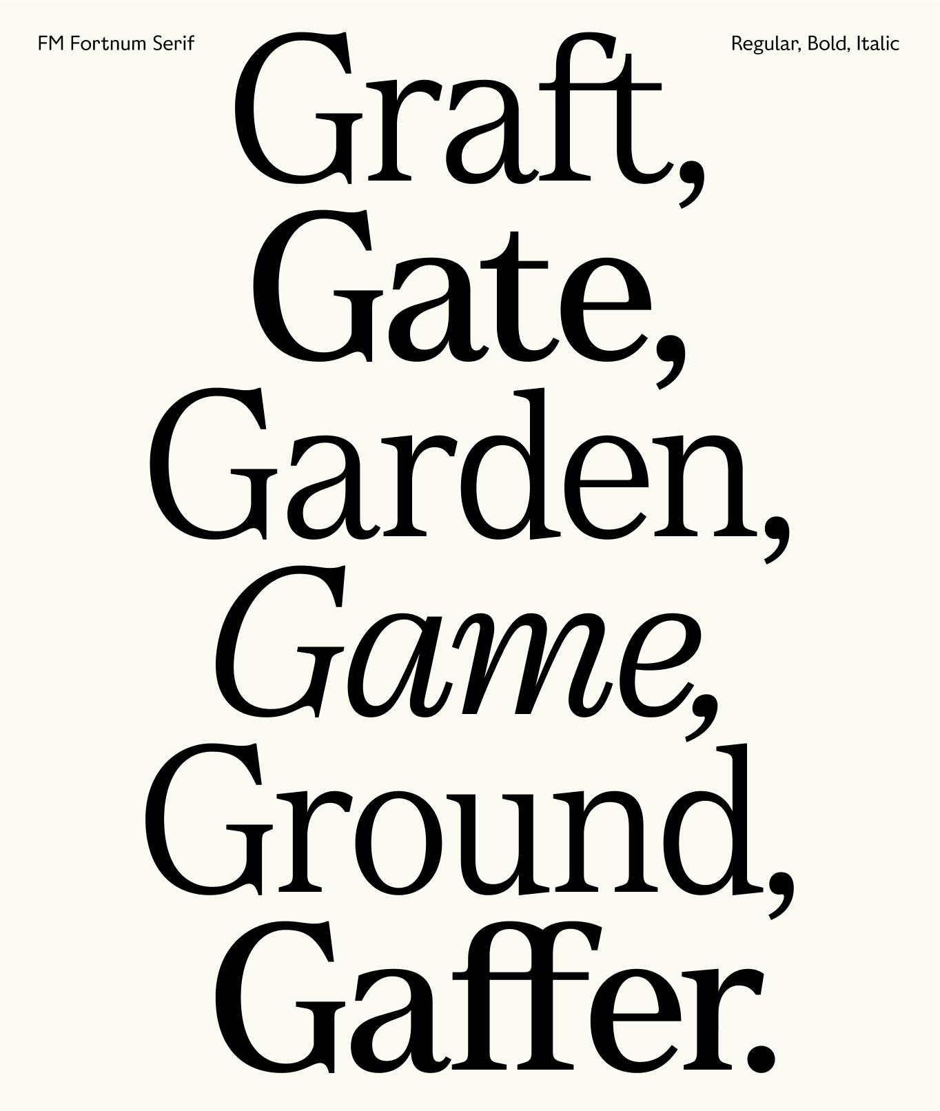
FM Fortnum Serif evokes a sense of heritage, expertly balancing the elegance of contemporary type design with a timeless quality. It draws inspiration from the penmanship of calligraphic letterforms, seamlessly blending tradition with modernity to create a face with an overt nod to craft.
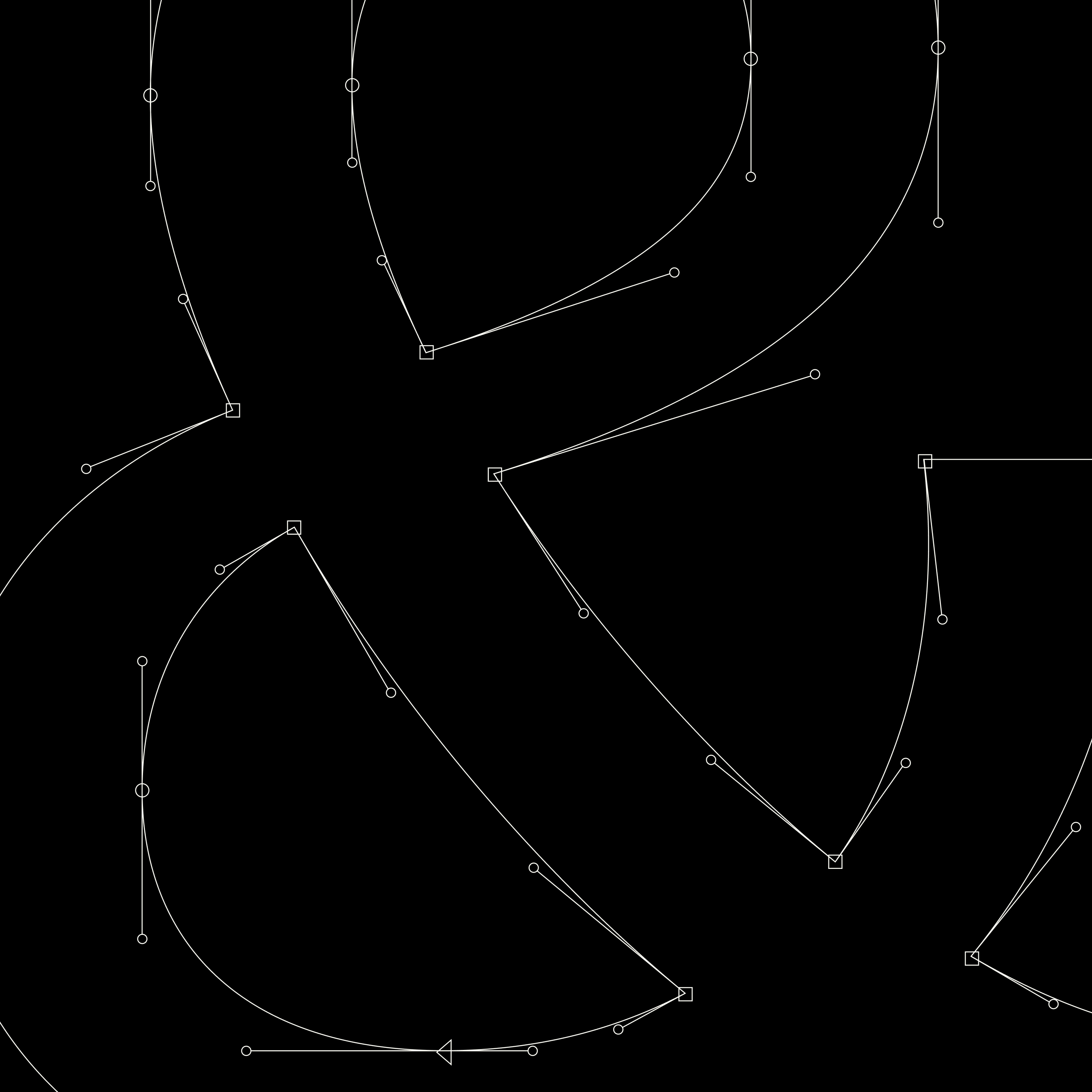
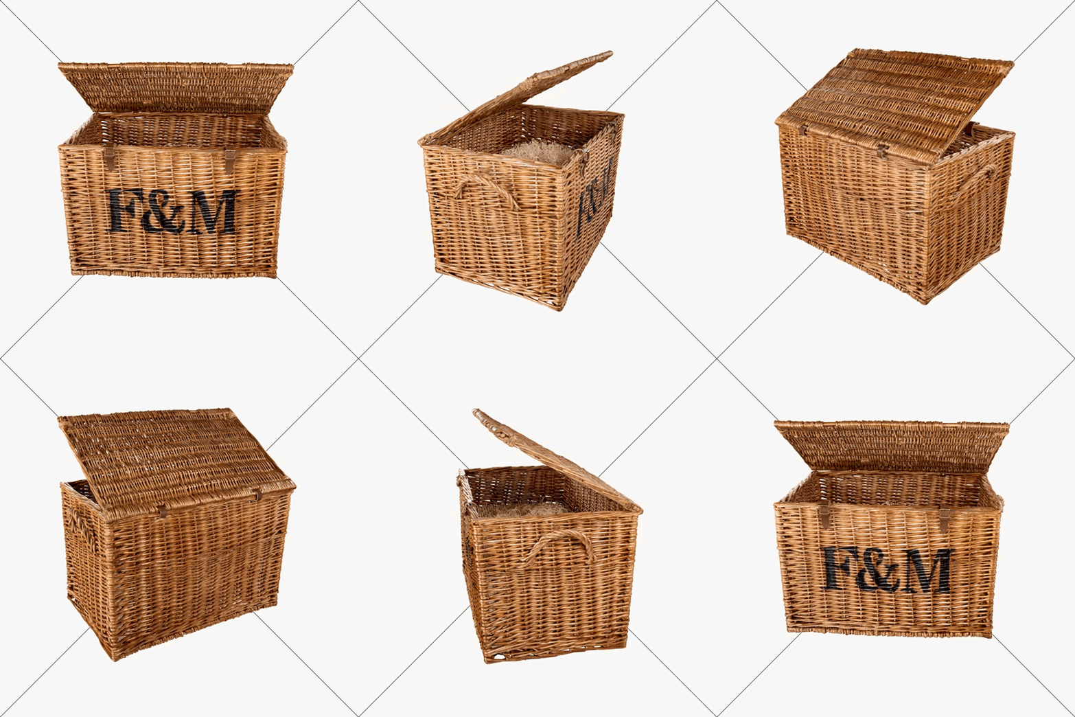


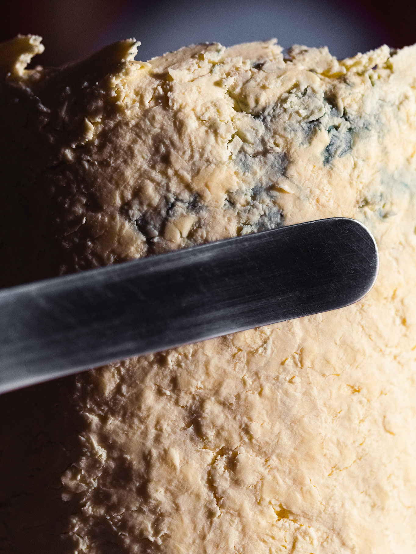

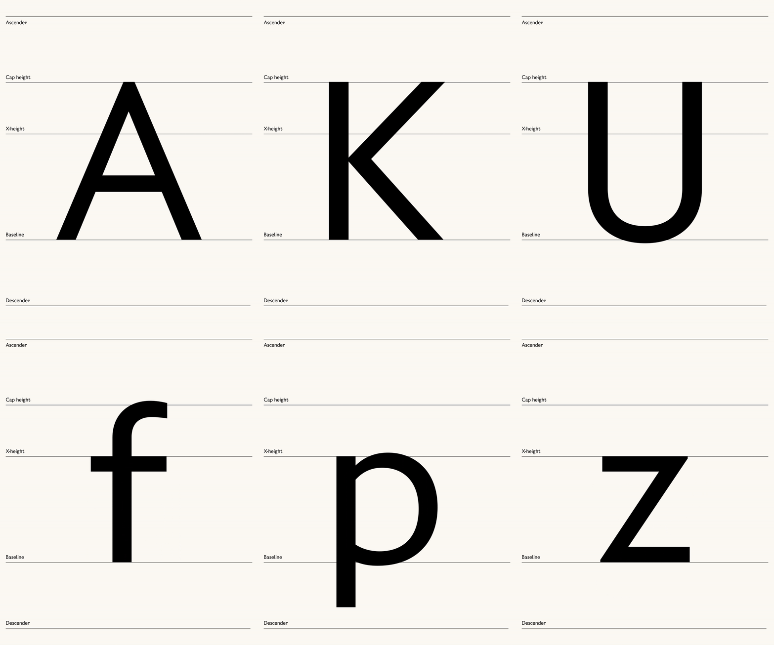
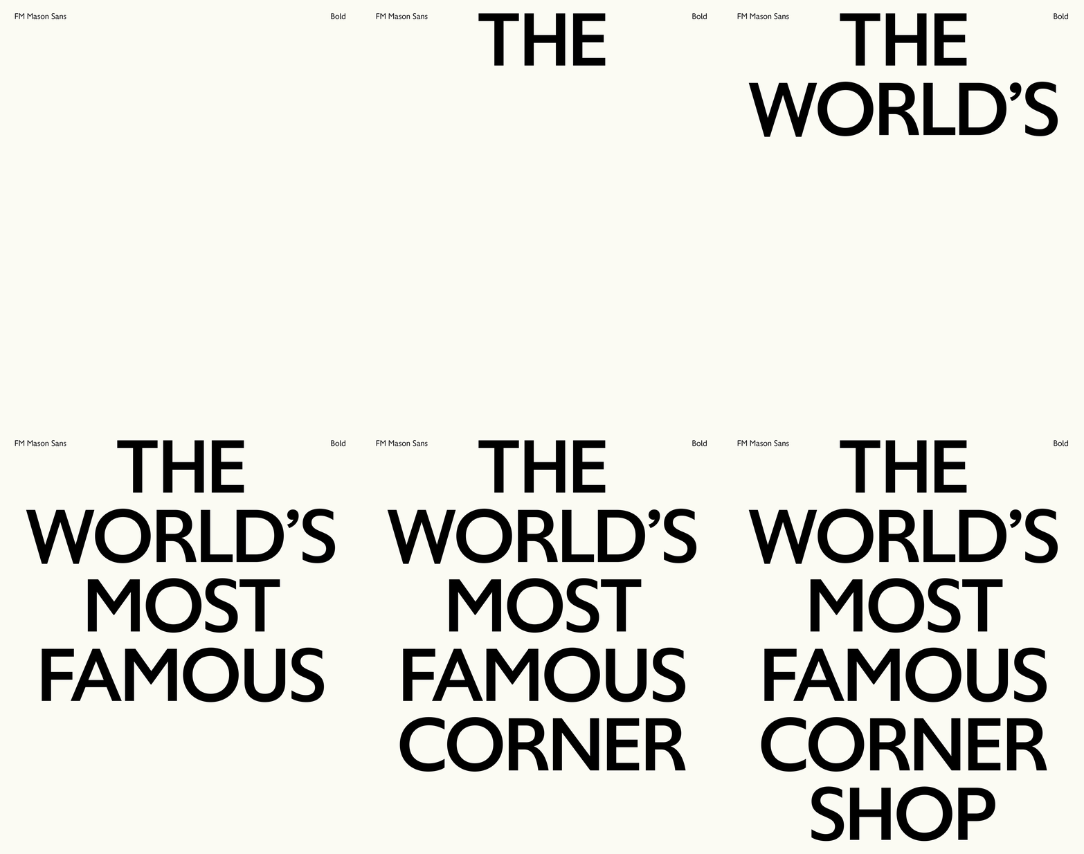
To complement the serif, the collection includes FM Mason Sans, a sans serif typeface that pays homage to Britain’s storied typographic history and its distinct identity, creating a versatile and hardworking face imbued with a quintessential British character and quirk - built digital first.
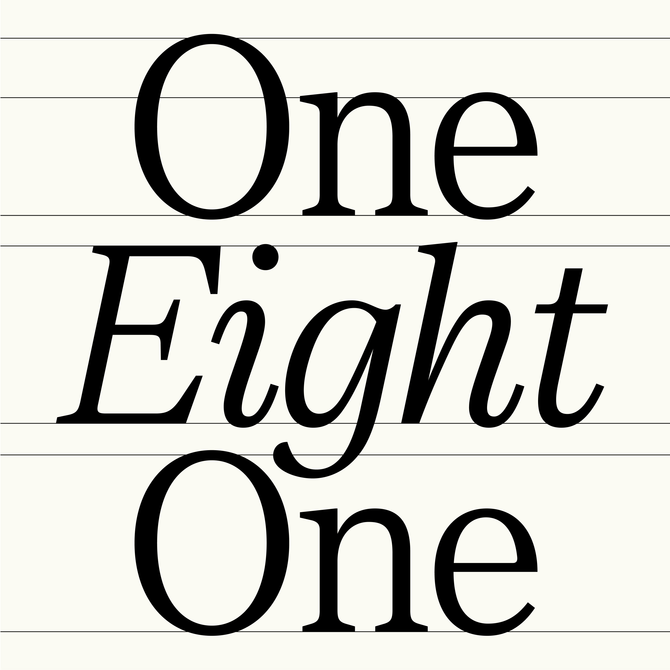
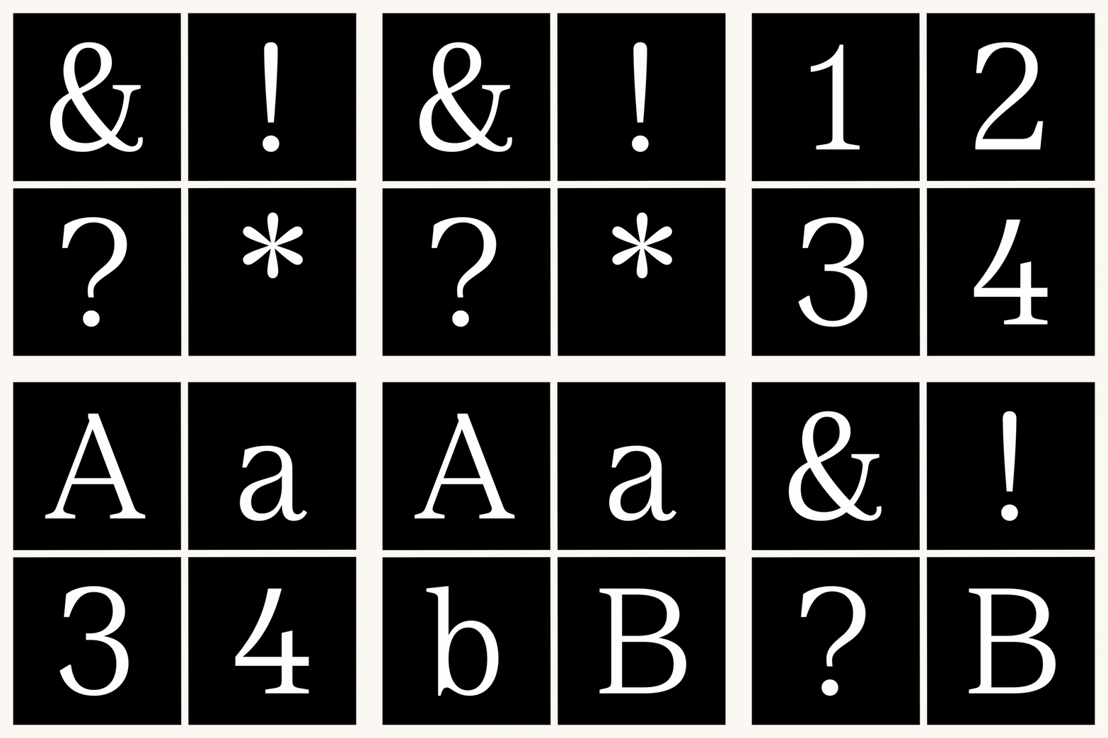
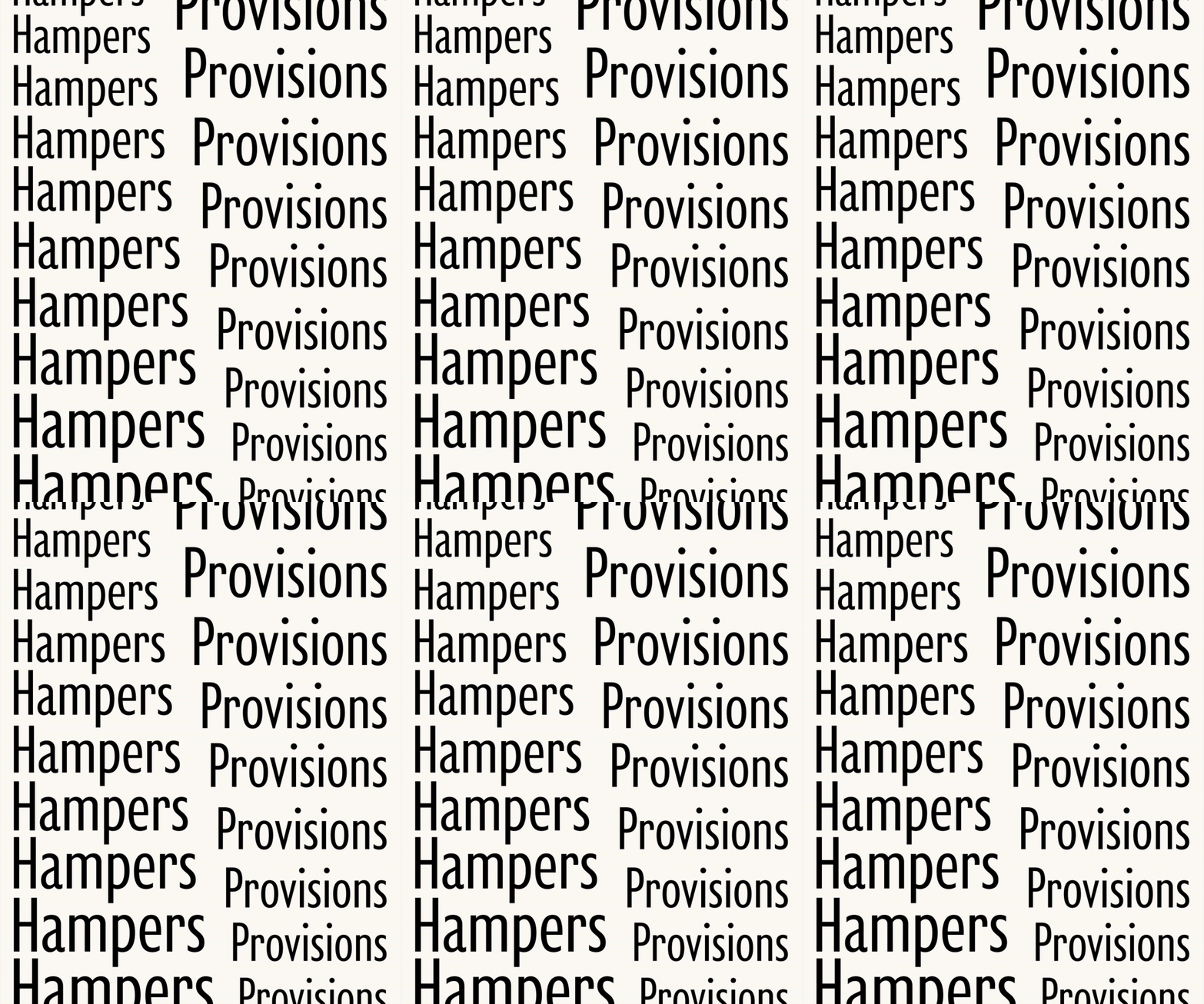
The main font characteristics extend to the even harder working condensed collection, bringing the families typographic style to the smallest and most functional outputs across the wide range of packaging.


